[China Packaging Network News] This is food, and it is not just food - like handicrafts, dishes and luxury goods, it is necessary to prepare for special occasions or make special occasions special. In order to highlight the unusual status, more and more high-end brands use patterns that are rooted in jokes, humor, nostalgia, and comfortable emotional relationships to package.
For Carla Hall, owner of the Carla Hall Cookie Company, all this is related to love. Carla Hall's slogan is: Carla Hall, love is boundless. "All I did was from sincerity and love," Hall said. Hall is one of the hosts of the TV series “Delicious Cuisine†and participated in the “Top Chef†contest.
The mouth-watering handmade cookies of this biscuit shop are handmade. Flavors include a variety of sweet and savoury flavors, such as: Almond Ginger Cherry Crunch Cookies, Chocolate Hazelnut Pralines, and Cheddar Walnut Biscuits.
Hall's dedication to cooking is fully reflected in its recently redesigned logo. The design is a heart containing the chef's signature. The logo was designed by General Design Co., a Washington-based designer. The heart of the chef's signature is the core element of the Carla Hall cookie package. Design patterns are printed on pressure-sensitive labels and appear on various company packaging, including plastic cups, cellophane bags, and cardboard boxes.
Hall's roasters hand-wrap cookies in transparent bags and packaging cups. Billie-Ann Plastic Packaging, Inc. of Brooklyn, New York, supplies packaging cups that are cylindrical and have caps on the bottom and top. Packaging comes in two sizes: standard sizes can hold 6 ounces of biscuits; smaller ones can hold 3 ounces of biscuits for gift wraps of various flavored cookies. A new type of wedding gift or company gift package contains a single 3 oz. cup.
The company also offers 12 ounces of packaging for the health food market - biscuits are packaged in industrially degradable square barrels made of polylactic acid. In all cases, this rigid plastic package protects the cookie while providing a viewing angle of 360 degrees. Carla Hall Cookie Company originally used canned packaging of its products; however, in order to allow consumers to see the product before buying, it turned to transparent packaging.
For giving up cans, Hall said: "We prefer things that are lightweight, things that look natural, and things that are environmentally friendly... Plastic packaging is both easy to store and cost-effective."
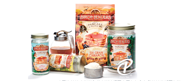
Birch Benders Micro-Pancakery chose fantasy and colourful illustration packages for its delicious pancakes and waffles.
"Nostalgic and whimsical"
Birch Benders Micro-Pancakery, Colo., used a completely different approach in its recent brand remodeling effort to choose fantasy and colourful illustration packages for its delicious pancakes and waffles.
Lizzi Ackerman, chief operating officer of what is known as “Dr. Pancake†explains: “We want to bring people a nostalgic and whimsical feeling that is not limited to a particular time or place.†Hand drawn Illustrations create BirchBenders' different world and timeless feeling. She added: “What we want is classic and really interesting.†Birch Benders and Moxie Sozo have redesigned the packaging. The artist Charles Bloom painted all the illustrations.
Birch Benders' flagship package is a jar; when making a pancake or waffle batter, consumers simply add water to the jar and shake it again. Small cans that make three to five pancakes are made of glass, and larger cans that make 16 pancakes are made of PET.
As part of its rebranding, the company added bag-type packaging to its packaging format, including 16 ounces of self-supporting bags and 24 ounces of resealable flat-bottomed boxes (side and bottom of the package). A solid panel was chosen. The supplier of the packaging is California's Innovative Packaging Solutions Company.
These new illustrations were printed on Birch Benders packaging cans and bags, and the illustrations became a considerable number of billboards. Ackerman pointed out: “In the area of ​​branding, the area of ​​pancake is not known for branding. This is not the most exciting area. We want to change it. The products we want to provide are visually stimulating and delicious. , And make easy products. We are the only company that produces natural organic pancake mix prefabricated powder (only use water when used)."
She added: “We don’t want to seek inspiration just by paying attention to pizzas, we also seek ideas from products in various areas of grocery stores and other stores, trying to provide consumers with truly interesting and unique things. We call ourselves Part of the reason for the micro-pancakery is that we have been inspired by micro-breweries and other cool craft beer workshops that we have created. We have studied a large number of beer labels."
Make candy sweet
For Atlanta-based Sir Francis Bacon sweets company, packaging design plays an important role in the development of its products. The company positions itself as an upscale, but not too serious, handmade candy maker.
The company produces a type of peanut brittle product called Sir Francis Bacon. Yes, you can't make mistakes. It's made of peanuts made of bacon; in addition, there are Sir Francis Bacon chocolate bars wrapped in dark chocolate. All products are produced in small batches and hand-packed.
Bob Coyle and Steve Saari, co-owners of Sir Francis Bacon, use the company's background in advertising and marketing to create unique brand positioning for these distinctive products. On its cassette-packed Sir Francis Bacon candy-paper label, the famous 17th-century Francis Bacon's head was printed with a nose mask for a Halloween costume.
Saari said: "We want to express a kind of 'half-joking humor'. Without this pig nose, the illustration is a bit serious. But after we add such an element to Mr. Bacon's nose, the entire tag It suddenly became fun and easy.†A pig's nose, together with the trademark “Bacon†(Bacon), immediately conveyed a product that was made with bacon.
The use of such a photograph of Mr. Francis Bacon, saved in the archive, also strengthens the high-quality market positioning of the product. Saari said: “A hand-painted portrait that is well-crafted gives people a new feeling of the old world, which makes our products find the right brand positioning.â€
The packaging structure of peanut and chocolate bars is very simple. There are two packaging sizes (3 ounces and 8 ounces) in the peanut butter package. The candy is manually packed in plastic bags and heat-sealed into corrugated paper in a paper box. Finally, the packaging box is packaged using a paper label printed with a packaging pattern.
The 3 ounces of tahini chocolate bars are placed in aluminum foil pouches and then packaged in printed label boxes.
Unbleached kraft paper is used for the carton and crepe paper materials, giving the package a natural feel. Coyle said: "For a particular customer, it's important to adopt a natural design and convey the feeling that the product is close to nature."
He added: "Packaging is a forerunner of any sales. Without good packaging, consumers can't be excited and they can't make them want to buy what you offer."
Sir Francis Bacon's peanut candy box features the famous head of Mr. Francis Bacon in the 17th century. To add fun, a mask of a pig's nose for Halloween costumes was added to his nose.
"It's fun and delicious."
Adding a bit of fun to the regular product is the focus of Los Angeles-based Jen & Joes cookie Doug, which recently redesigned the package for pre-baked, delicious cookie dough sold frozen.
For packaging, the company used a flow-wrapped paperboard tray in cardboard cartons. Each carton contains 12 doughs, each weighing 12 ounces. The new packaging will be launched in September.
Jen & Joe’s cookie dough has six flavors: chocolate bars, cinnamon, oat taffy, white chocolate mustard, lemon, and spicy chocolate. High-quality ingredients are a source of pride for the company. They claim that they are using real eggs and butter and are free of artificial colors, flavors, additives and preservatives.
This is important because all ingredients are prominently listed on the front panel of the carton pack. The Food and Drug Administration (FDA) stipulates that the list of listed nutrition, as well as extended information on flour and complex ingredients, such as prepared horseradish juice and white chocolate, must be displayed on the back of the carton together with the allergy alert.
The president of Jen Laska said: “We know that the word “all naturalâ€... has become meaningless. We don’t want to say anything more on packages that consumers no longer trust.â€
She added, "When consumers see the front of the package, what is the first thing they do? They will pick up the package and turn it over to see what's in the ingredients list. So I think why we are not From the very beginning, what they want to know is provided to them? I have nothing to hide about this cookie dough, so let's just positively show them what they want to see.â€
The packaging of Jen & Joe's products is also easy. It has a vivid color, a simple design and a playful attitude, including the image of a mouth-shaped cookie that has been bitten. Hull+ Honeycutt Marketing and Design, based in California, offers this packaging design idea.
Laska said: "The most important thing is the taste of food, but we don't want it to look boring. We hope it is fun, fun, and colorful, because children and adults like color." Various flavors of cookies. Laska finally added: "I put mustard in the biscuit - I can't make myself too serious. We want it to be fun and tasty."
Panty Liners,Sanitary Napkins,Disposable Products,Baby Diapers
JFGKFHK , http://www.nbpadproduct.com